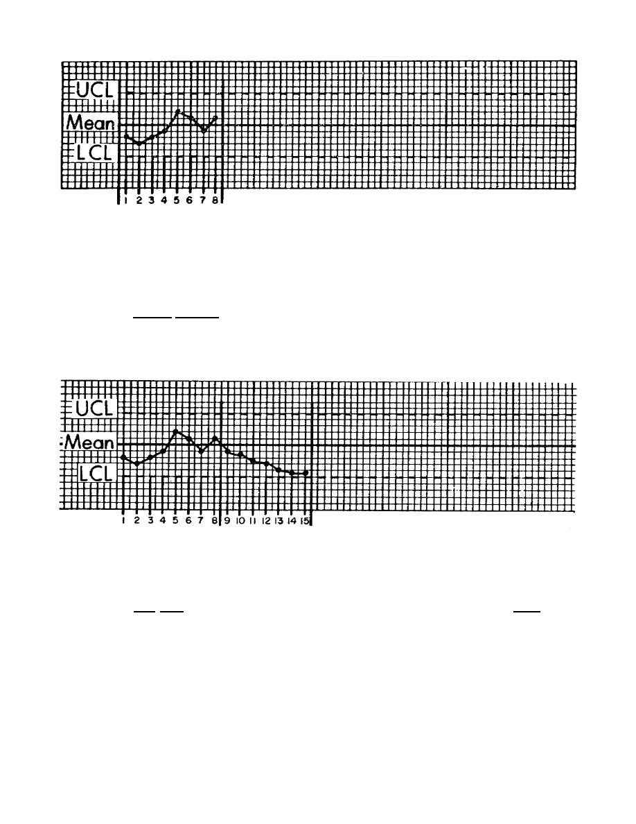
Figure 28
d. In figure 28 we have added some dots, connected by lines. These dots, for the purpose of
this control chart, are plotted gamma values for eight consecutive days. By merely connecting the dots
we make them easier to follow. Notice that all the dots are within the central limits, which means they
are acceptable. These are called "chance causes." They are both above and below the target line, which
is what we call random variation.
The evaluation of these plots indicates the process is performing acceptably, and that no change
to the process is needed.
Figure 29
e. Figure 29 represents the next seven days' plots. The first consideration is that all plots are
chance causes (within the control limits); however, they are all moving in the direction of the lower
control limit. Five plots or more in one direction, either high or low, is considered a trend. Even
though all the plots are within the control limits, they indicate that the solution strength is decreasing
and that the gamma will soon plot outside the control limits.
71


 Previous Page
