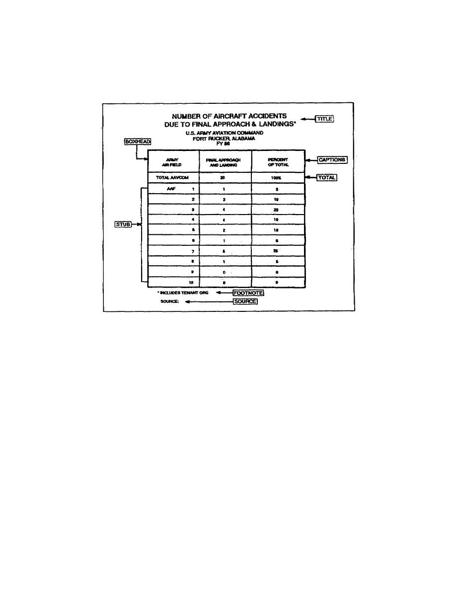
have a balanced, clear, and simple table. The majority of the time,
this process requires you to make several rough drafts. Do not forget
to consider the illustration ratio of the table. If it is a master for
a 35mm slide or view graph, you would then use a 2 to 3 ratio. You must
consider each component of the table when constructing it.
Figure 155. Specialpurpose table
When constructing a table, you must organize the body of the table so it
presents the data simply, clearly, and emphasizes the important data in
the table. Because Western cultures read from left to right and top to
bottom, this is the first place the eyes go to when reading the table.
Therefore, the top left of the table is the best place to position the
data that the table emphasizes. Additionally, you should design the
entire table so all data, stub heading, and boxhead caption read
horizontally.
Take a moment and review figure 154. As you can see, this table
emphasizes the total number of major aircraft accidents. Therefore, the
designer placed the totals in the top left corner of the table. There
are many other instances when you could design the table with the totals
at the bottom, which is perfectly acceptable.
1-60
SS0530


 Previous Page
