For the best visibility of lettering on television graphics, use a simple
style of lettering, with each character constructed consistently and
clearly. Do not use complicated or ornate lettering styles such as Old
English because viewers have a hard time reading them at a glance.
Additionally, you should not use extremely thin letters because there is
a chance of losing part of them during the transmission.
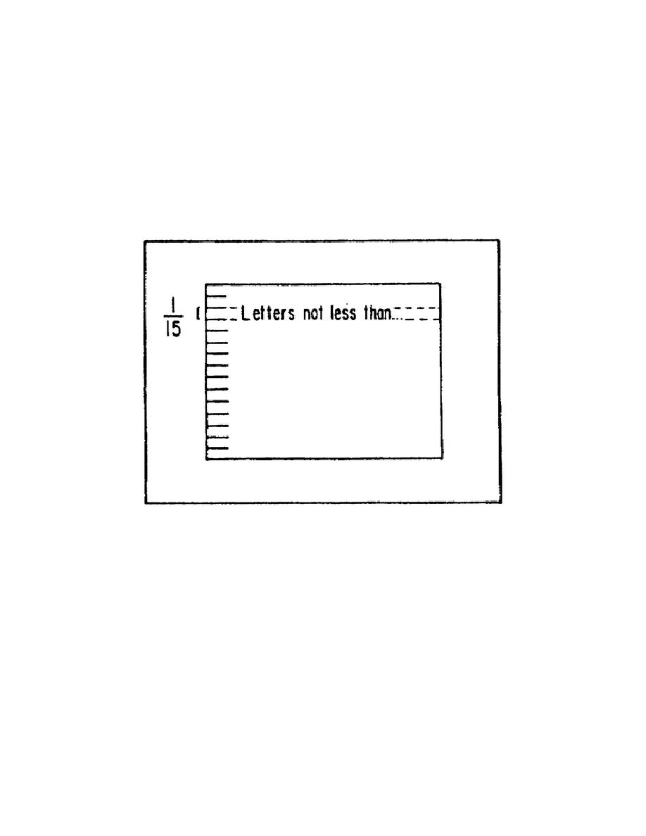
(2) Determining letter size. There is a simple rule to apply to
determine the minimum size of lettering that provides maximum visibility:
The height of the lettering equals at least 1/15 the height of the
graphic. For example, when a graphic has a vertical height of 15 inches,
it should have lettering at least 1 inch high (figure 2-18).
Figure 2-18.
Minimum lettering height
When lettering a television graphic, you deviate slightly from the
standard rules for spacing because the television camera tends to cause
the lettering to appear closer together than it is.
Therefore, the
spacing used is wider than normal. For these types of graphics, never
use a space less than half the thickness or larger of the two letters it
separates.
To produce television graphics with quality lettering, you should use
minimum lettering only when necessary to present a large amount of
information in a limited space. Keep the minimum to a minimum, do not
let it become the standard for your lettering.
2-30
SS0530


 Previous Page
