The sansserif Gothic face shown in figure 14 is in common use today.
Compare the Roman typefaces shown in figure 13 with the Gothic typefaces
shown in figure 14. Notice that the Roman face is easier to read than
the Gothic face, particularly in the smaller sizes. You can use Gothic
style letters in a wide variety of applications today. The following
paragraphs list a few of these applications.
(1) You generally use Copperplate Gothic for letterheads, envelopes,
cards, announcements and many types of official forms.
(2) Use News Gothic in the body of newspapers for titles and
headings.
(3) You primarily use Franklin Gothic, Alternate Gothic, and Poster
Gothic to letter display work. They are popular for posters and as
headers on viewgraphs, charts, and tables.
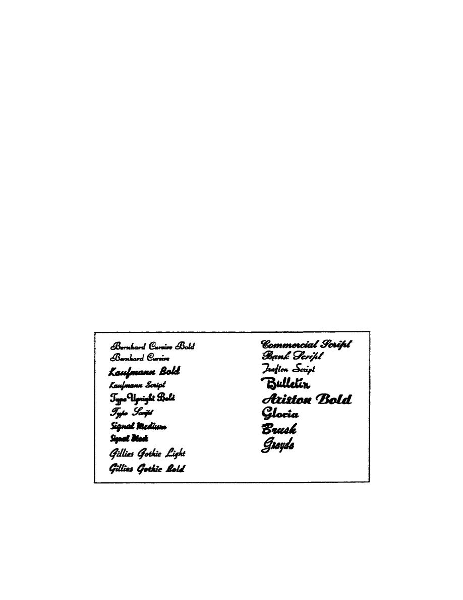
d. Script and Cursive. Script and cursive (a style of printed letter
that imitates handwriting) type are classified together. Script letters
have small connecting links called kerns that link the letters together
giving the lettering an appearance of handwriting. Cursive letters do not
have these kerns. Refer to figure 15 and compare the Bernhard Cursive
style with the Ariston Bold style. Notice that the Ariston Bold more
closely resembles handwriting than does the Bernhard Cursive. This is
because the Ariston has kerns, while the Bernhard does not. Cursive type
is patterned after oldfashioned hand lettering, while script imitates the
old slanting handwriting.
Figure 15. Script and cursive typefaces
1-5
SS0525


 Previous Page
