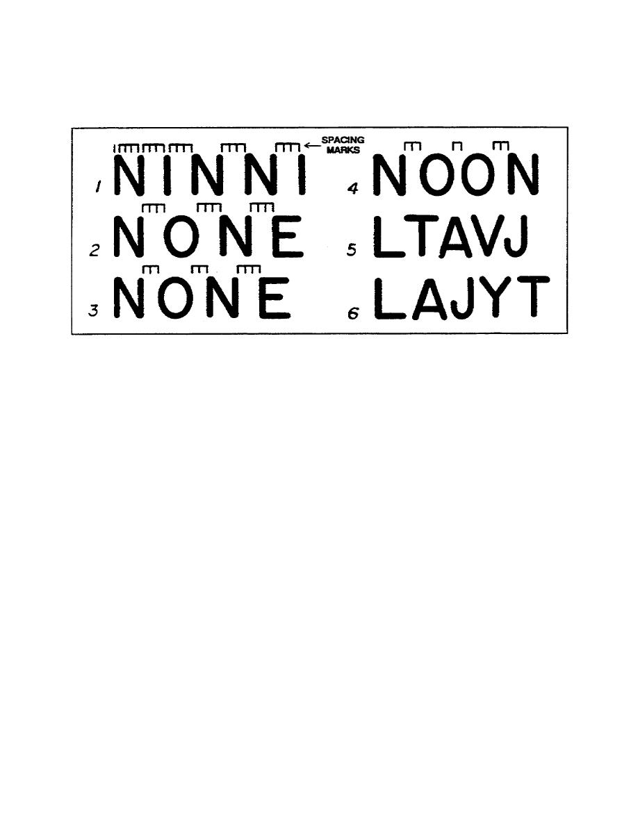
letter N. Record this distance. This is the appropriate distance between
the letters. Notice that all the letters on line 1 are separated by the
amount of white space in the first letter in the group, therefore, they
appear to form a word. This procedure works well for spacing between
letters with straight sides.
Figure 110. Spacing between letters
b. Now refer to line 2 in figure 110. This line retains the same
spacing as line 1. However, the uppercase letter 0 does not occupy the
same amount of space as the letter N; therefore, the spacing between the
letters appears unequal. By reducing the space between the N and O and
between the 0 and the N from three measured units to two measured units,
you restore balance. Notice how much better the word "NONE" appears on
line 3 than it does on line 2. As a general rule, the space between round
letters and straight letters should be less than the space between two
straight sided letters.
c. Look at line 4 in figure 110. Balance is obtained on this line by
reducing the space between two round letters to one measured unit, and
retaining the spacing between round and straight letters at two measured
units.
d. Now look at lines 5 and 6 in figure 110. The spacing of letters
that have odd shapes such as these deserve special attention. Those on
line 5 present no particular problems and can even overlap such as the V
and J. For such combinations, use your best judgement. Space the letters
whichever way best achieves balance. The letters on line 6, however,
present some special problems. One way to achieve balance is to shorten
the horizontal stroke on such letters as L and T. Again, there are
1-10
SS0525


 Previous Page
