no hard and fast rules. Use your best judgement and seek the advice of
more experienced personnel if they are available to you. When time
permits, examine magazine articles and advertisements for other ideas on
letter spacing.
7.
Word Spacing.
Another issue that impacts on legibility is spacing between words. As
with other matters regarding lettering techniques, experts in the field do
not always agree on any one approach. Generally speaking, there must be
enough space to separate words from one another, but not so much as to
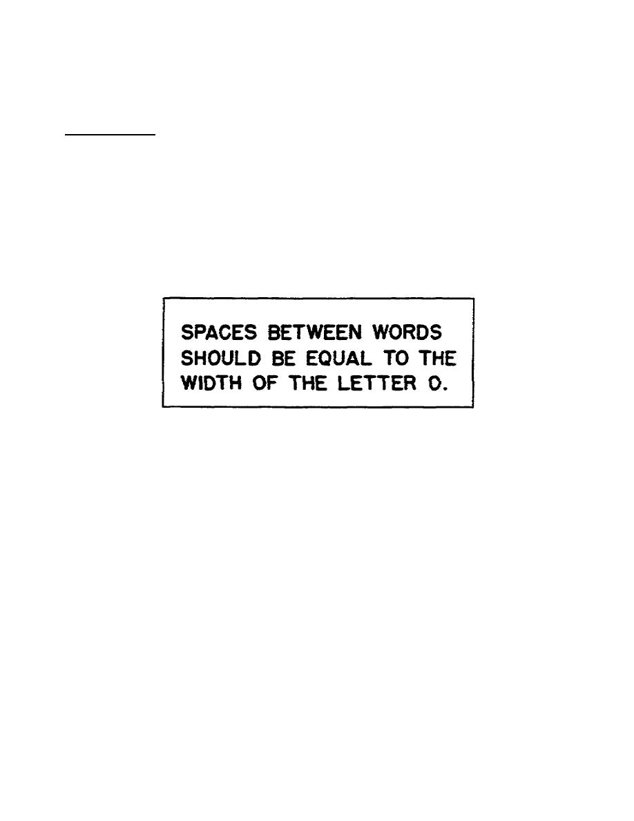
cause us to read one word at a time. In general, follow the guidelines
specified in figure 111.
a. Using the letter 0 is convenient, the letterer needs only to make a
circular movement above the paper next to the preceding word.
Figure 111. Spacing between words
b. When spacing words, you must consider the characteristics of the
last letter in the previous word and those of the first letter in the next
word. The following paragraphs provide some techniques to help you
achieve proper word spacing.
(1) Leave a space equal to the capital letter O between two half
height, straightstemmed letters such as H and E, or D and B. If one or
both letters are curved, reduce the spacing by about 1/3.
(2) If the two letters are lowercase, use the lowercase letter o
using the conditions explained previously.
(3) If one letter is uppercase and one is lowercase, use a space
equal to 1/2 of the uppercase O plus 1/2 of the lowercase o. Figure 1
12 is an example of balanced spacing that employs all the techniques
discussed thus far in this lesson. This concludes our discussion of word
spacing. Next we will discuss line spacing.
1-11
SS0525


 Previous Page
