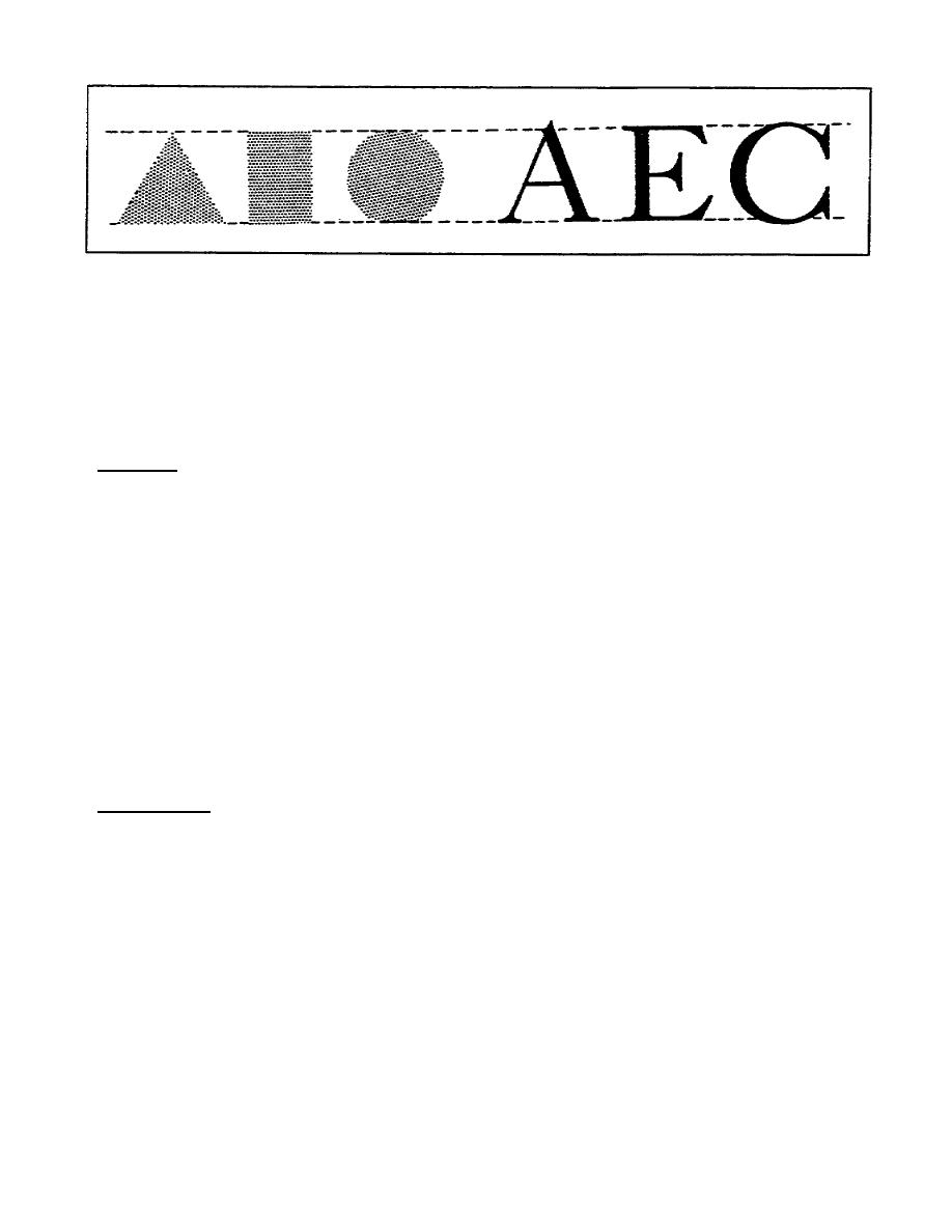
Figure 116. Optical illusions in lettering
a. Enlarge the letters that have either circular or rectangular shapes
by extending the rectangular shapes above the guideline, and extending
circularshaped letters both above and below the guidelines.
b. Use this same principle to adjust the apparent height of lowercase
letters.
11. Summary.
This concludes our discussion of lettering principles. In this part of
the lesson, you have learned several techniques that will improve your
lettering skills. In the next part of this lesson, you will learn the
basic strokes necessary to form balanced letters. You will also learn how
to use guidelines and grids to form balanced, wellconstructed letters.
PART C USE OF BASIC STROKES WITH GUIDELINES AND A GRID
In the previous part of this lesson, you learned the importance of
legibility in lettered work. You also learned some techniques to achieve
legibility in your lettering projects. In this part of the lesson, you
will learn how to use some tools to achieve consistency and balance in
your lettering.
12. Guidelines.
Guidelines are light pencilruled lines you place on your work. You then
form your letters between these guidelines. The overall appearance of
your work will depend largely on how well you measure and construct
guidelines. Accurate guidelines help you achieve balanced line spacing
and uniform letters, both of which are important elements of legibility.
To construct accurate guidelines, you will need a printer's rule or
another device that is graduated in points and picas, a sharp soft lead
pencil, and a set of dividers. There are four guidelines, each has a
name, each has a purpose, and a defined relationship exists both between
and among them. Refer to figure 117.
1-15
SS0525


 Previous Page
