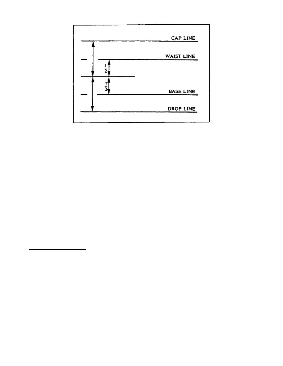
Figure 117. Guidelines
a. Cap Line. This is the line that defines the top of capital letters
and the top of ascenders of small letters. Start the strokes for capital
letters and for the ascenders of small letters from this line.
b. Waist Line. Use this line as the top of lowercase letters that do
not have ascenders or to begin the swell of lowercase letters that do not
have ascenders.
c. Base Line. The base line is the bottom guideline for the swell of
lowercase letters. It is also the bottom line for uppercase letters.
d. Drop Line. This is the line that serves as the guideline for the
bottom of lowercase letters that have descenders.
NOTE:
We explain the terms ascender, descender, and swell later in this
part of the lesson.
13. Guideline Spacing.
You determine the spacing between guidelines by the size of the letters
you use. Regardless of the size of the letters, the spacing between the
lines must always have the same relationships. The spacing between the
cap line and the waist line should be approximately one half (1/2) that of
the spacing between the waist line and the base line. Use these
guidelines to assist you in achieving balance and stability in projects
you letter.
1-16
SS0525


 Previous Page
