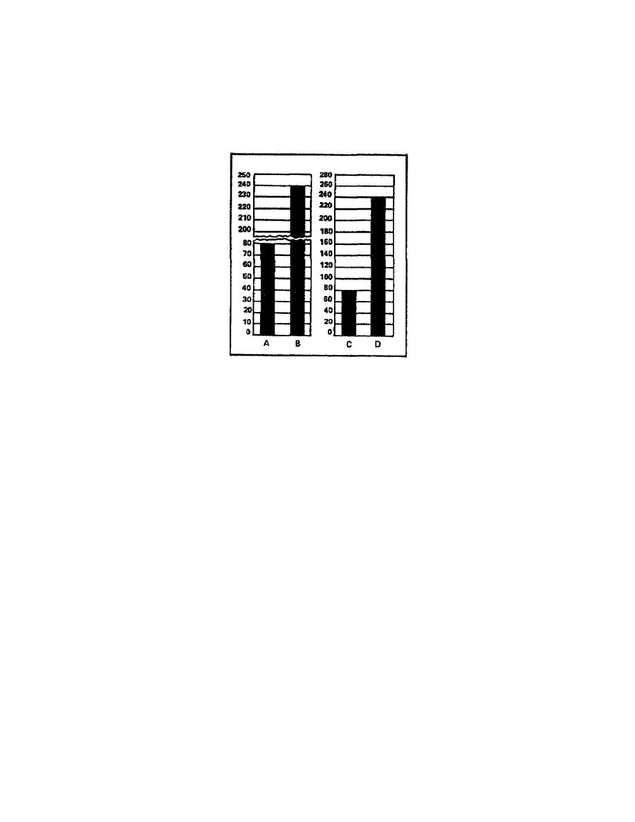
Figure 15, columns A and B, show the adverse affect of splitting the
scale. Column A appears to be about 1/2 the height of column B, which
is not the desired comparison. When you examine the scale closely and
do some simple math, you can determine that column A is actually 1/3 the
height of column B. Columns C and D give the correct comparison of the
columns because these columns use a better designed scale.
Figure 15. Split scales give wrong proportion of the data
The data the chart presents has a direct bearing on the scale you
select. When determining the scale, you must pay particular attention
to the smallest value the chart shows. There are two extremes you
should avoid: choosing a scale with unrealistically small increments and
choosing a scale with unrealistically large increments. A welldesigned
chart scale should fall somewhere between these two extremes.
For example, when a chart presents data with no quantity smaller than
100 units, then you should not use a scale with increments of 5 units.
The opposite of this statement is also true. If a chart presents data
with increments all below 25 units, you do not use a scale with
increments of 50 units. You would find plotting the data using that
scale extremely difficult.
Examine figure 15 again. You can see the only change made to correct
the chart so columns C and D give the correct proportion was the scale.
The change doubled the value of the scale's graduations. Changing the
scale eliminated the need for splitting the scale, thus, the chart
presented the data accurately.
1-14
SS0530


 Previous Page
