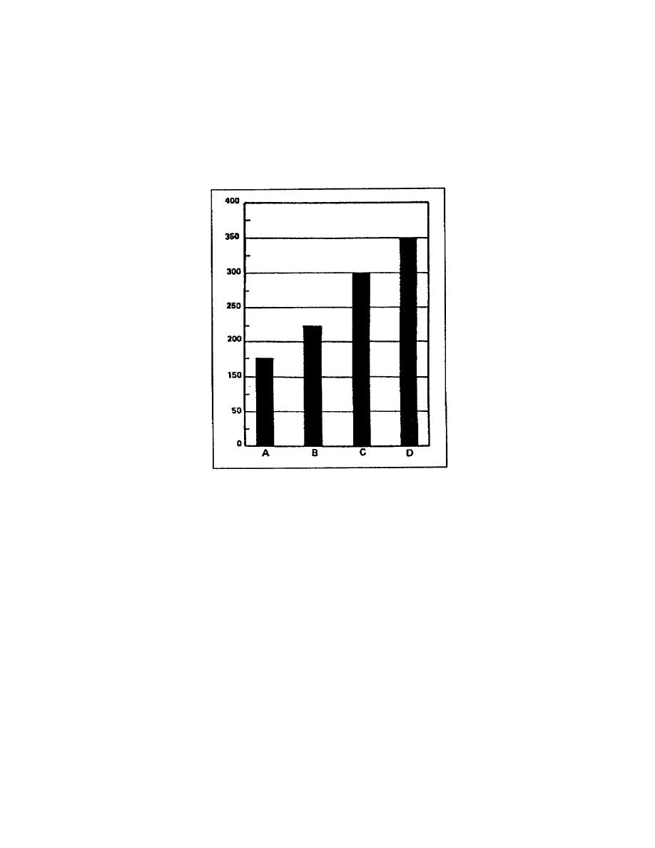
If the values the chart must present are large, you should use a
relatively large scale with less space for each individual increment.
Figure 17 shows units with values of 175, 225, 300, and 350 plotted,
all are large values with big intervals between them. When compared
with the scale used in figure 16, this chart's scale has large
increments and a small amount of space for individual increments. As
you can see, this chart presents the data fairly, and as the reader, you
have no problem assigning values to the plotted data.
Figure 17. Large scale with small intervals
The charts you design and construct must present the data accurately.
But you do not have to make them exact, that is no one will measure the
bars of the chart before assigning a value to the data. This allows you
a small amount of latitude when designing and constructing the chart.
If you plan to use a scale where 3/4 of an inch represents one dollar,
you would have difficulty plotting an amount such as 5.85. You could
avoid this problem by using an engineer's scale with graduations in
1/10th of an inch or the metric system, which uses multiples of 10 as
its base.
(2) Selecting a title. You should center the title at the top of
the chart and use only uppercase (capital) letters. Ensure the title
you select is clear and concise, tells the reader what data the chart
contains, and where it applies. You should never sacrifice clarity for
brevity. If you have any
1-16
SS0530


 Previous Page
