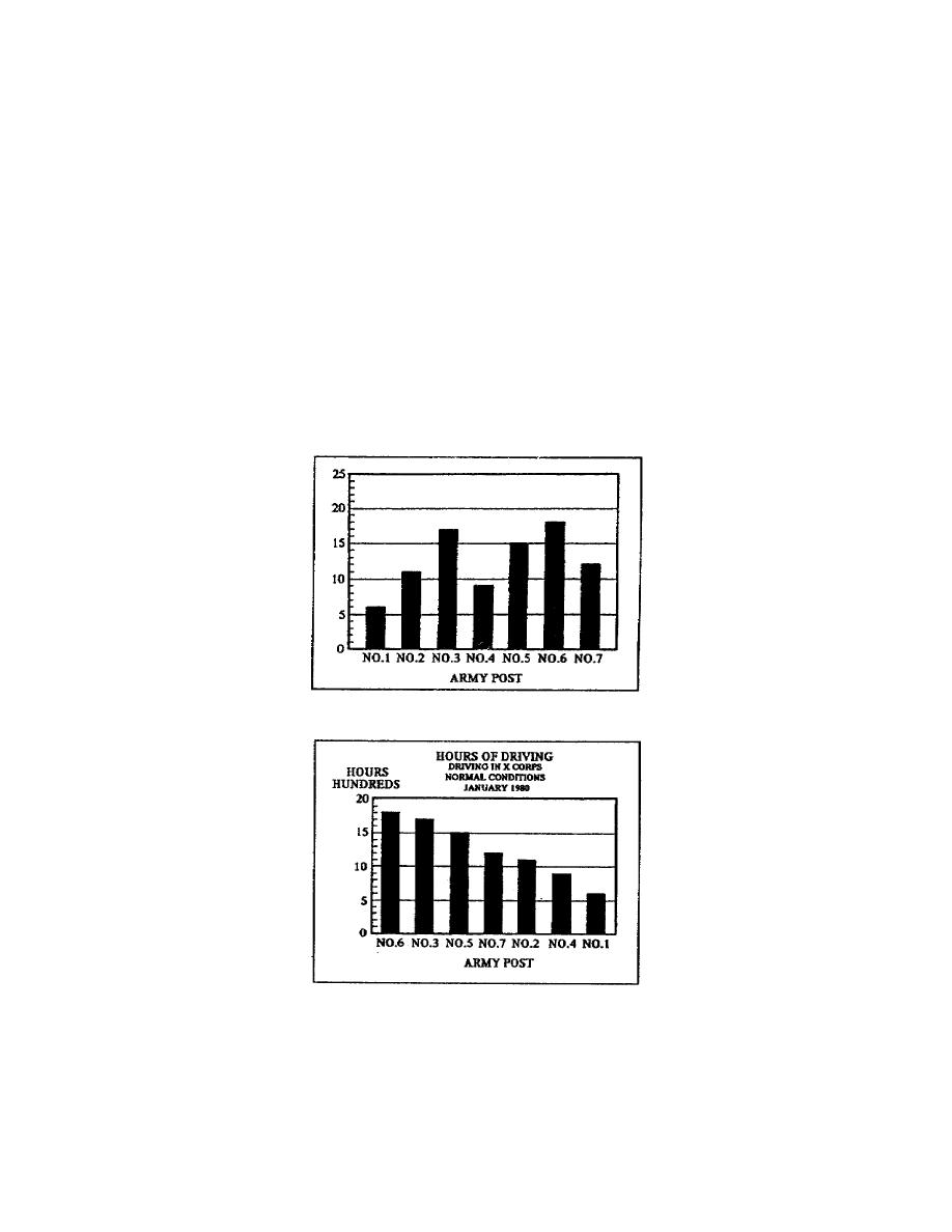
Figure 110 shows a poorlyconstructed column chart. The chart's title
is not properly placed and does not reflect the data contained in the
chart; the scale does not have a label. In addition, the designer did
not arrange the columns correctly or use a scale that allowed the
columns to end near the top of the chart. When arranging the columns,
you should arrange them in ascending or descending order, whichever
emphasizes the data on the chart. The columns should end near the top
of the chart to give the appearance of full quantity. However, the term
"near the top" means exactly what it says. You must leave a space
between the largest column and the top of the chart.
Figure 111 shows a wellconstructed column chart. The title reflects
the data contained in the chart and the designer has correctly
positioned it. The scale has a label that enables the reader to apply
values to the data in the chart, the columns have the correct
arrangement, in a descending order, and the largest columns ends near
but not at the top of the chart.
Figure 110. Poorlyconstructed column chart
Figure 111. Wellconstructed column chart
1-21
SS0530


 Previous Page
