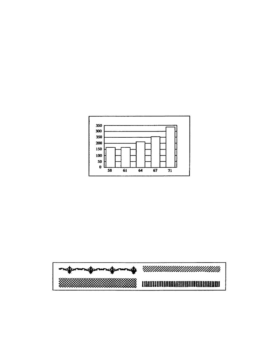
After you have drawn the scale lines and enclosed the chart, you plot
the data on the chart. When you plot columns on the chart, you do not
have to make them 100% accurate, they are approximations. Therefore,
you round off the values they represent to the nearest whole number.
Round off to the nearest dollar for the chart in this lesson. If you
want the columns to show 100% accuracy, label each column at the top.
Using the chart's scale, mark the height of the value of the first
column, draw a vertical line from the first mark on the Xaxis to the
height mark, and complete the column by using three spaces on the X
axis. Skip two spaces and mark the height of the next column. Plot the
remaining values using the same process. Remember, the distance between
columns is two spaces and each column uses three spaces (2 to 3 ratio)
(figure 117).
Figure 117. Plotting data
After you checked the chart for accuracy and appearance, you can ink the
chart. Make the lines forming the outer edges of the chart and the bars
thicker than the horizontal scale lines. When inking the chart remember
the horizontal scale lines do not pass through the columns or bars.
To add to the visual appearance of the chart and help the reader
establish the value of the columns, add pattern tapes, opaque tape, or
zipatone patterns. Opaque tapes are available in many colors. The
pattern tapes come in regular or irregular hatchmarks or designs. They
are helpful in creating a twodimensional texture on the chart (figure
118).
Figure 118. Pattern tape
1-25
SS0530


 Previous Page
