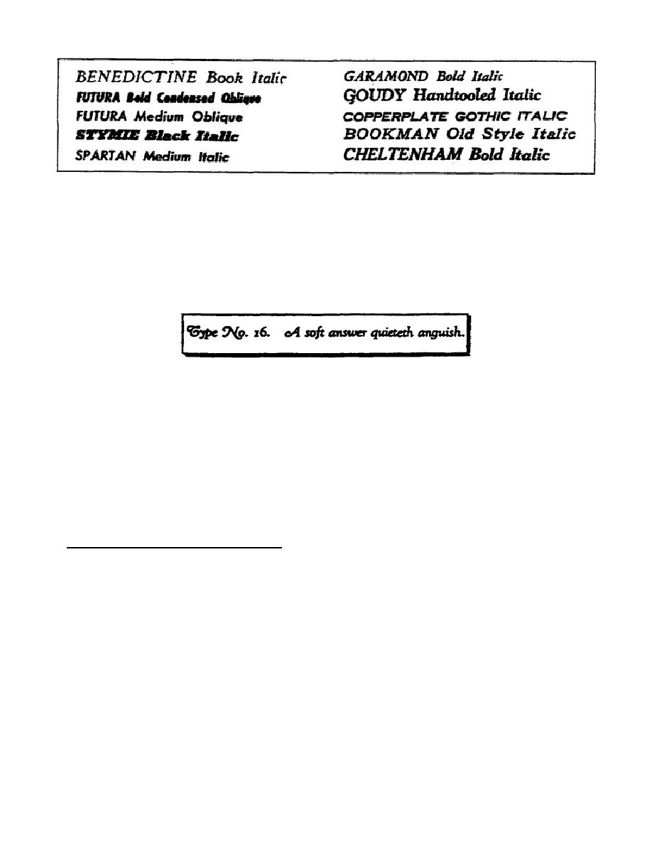
Figure 1-7.
Varieties of italics
g. Swash Lettering. Another style variation is swash lettering. They
are similar to italics but they are embellished with swirls and curves
called swashes.
They provide an alternative to or may be combined with
italics as a method of adding contrast, emphasis, or inviting attention to
certain portions of a lettering project.
Figure 1-8 is an example of
swash lettering.
Figure 1-8.
Example of swash letters
h. Contemporary.
As with many other art forms, fads creep into
lettering. New styles come and go. Some new styles catch on and endure
while others experience a relatively short, useful life.
Two distinctly
new styles that are gaining in popularity are the square serif and the
sans-serif.
The sans-serif closely resembles Gothic.
However, sans-
serif, unlike Gothic, has balance and near perfect geometric proportion.
Because of these characteristics, you may classify sans-serif as a
contemporary letter style.
Figure 1-9 presents some variations of sans-
serif type styles currently in use.
3.
Other Letter Characteristics.
a. Families and Type Series.
As a professional, you must know the
correct terms used within your profession.
Always use the correct term
when discussing lettering.
Thus far, we have discussed the six broad
classifications of letters and you have seen examples of each. There are
other terms used to classify letters with which you must be familiar. As
you have seen from these examples (figures 1-2 through 1-4) there are both
similarities and differences between letters within a specific style.
1-7
SS0525


 Previous Page
