can determine the trend taking place with the item. This type of chart
emphasizes the written text or oral presentation because the reader can
see the trend visually on the chart. When constructing this type of
chart, you must label each line in a way that does not confuse the
reader.
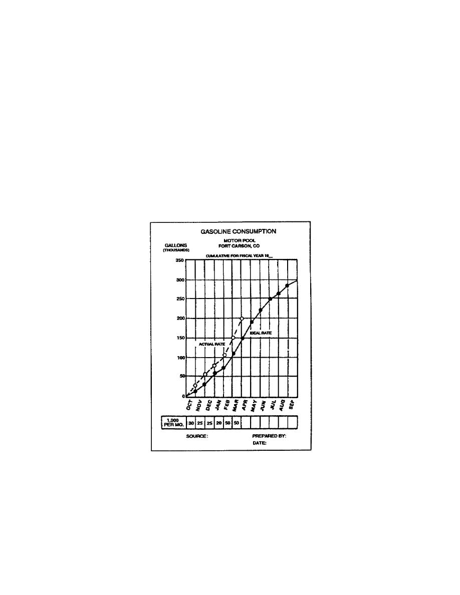
Figure 126 shows a consumption chart for the fuel used by a motor pool.
The funds allotted for fuel bought 300,000 gallons. Because of the need
for snow removal and heavy use of equipment during wintertime, the ideal
rate of fuel consumption is high for winter months and low for the
summer months. The ideal rate is the goal achieved by the motor pool
consuming less than 300,000 gallons of fuel. At the end of each month,
you add total gallons used to the previous cumulative total and plot it
on the chart. You can tell by just looking at the chart if the motor
pool has consumed more fuel than allotted for the time period. If the
manager does not establish economy measures, the motor pool will not
have enough fuel to make it through the end of the time period.
Figure 126. Consumption curve chart
You can also use the cumulative line to present two or more variables of
data on the same subject. Figure 127 shows the
1-32
SS0530


 Previous Page
