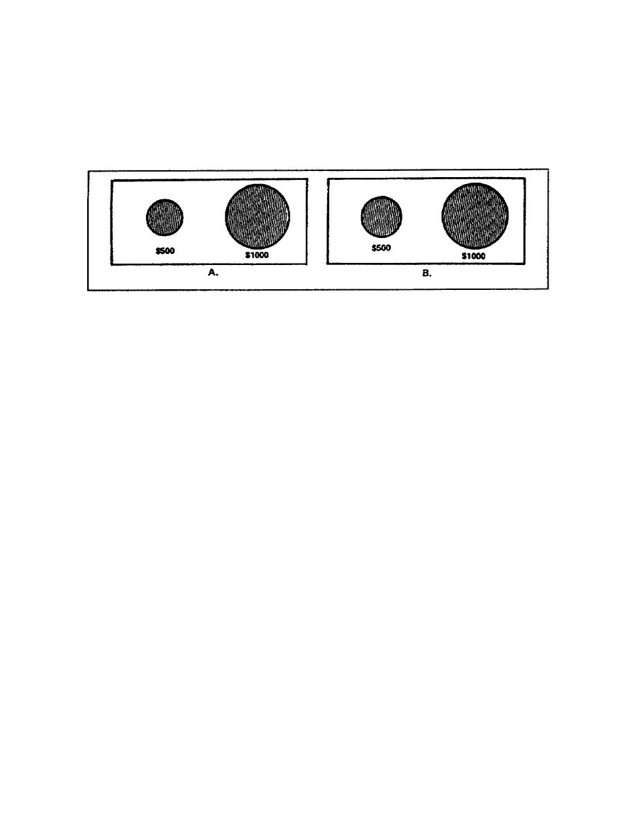
(b) Perception of pie chart (figure 129, part B). In part B
of figure 129, the area of the circle representing
||content||
,000 is exactly
twice as large as the area of the 0 circle. Though you know the area
of the circle representing
||content||
,000 is exactly twice as much as the area
of the 0 circle, the human eye again sees it as much larger. In both
cases, the human eye does not perceive the comparison correctly. For
this reason, you should not make comparisons using circles.
Figure 129. Pie chart comparing sizes
(c) Effective pie charts. For a pie chart to have maximum
effectiveness, it should stand alone and represent 100% of the compared
item. If you must use two or more pie charts on the same presentation,
make the pie charts the same size and ensure each represents 100% of the
quantity they compare.
(2) Plotting a pie chart. When plotting a pie chart, you need a
compass, protractor, and a straight edge. A pie chart begins as a plain
circle with a radius drawn from the 12 o'clock position to the center of
the circle. You plot the segments of a pie chart beginning at the 12
o'clock position and moving clockwise plotting the largest segment and
ending with the smallest segment. From each point plotted, you draw a
radius to the center of the circle. If you add colors to the segments,
add the colors from lightest to darkest moving clockwise (figure 130).
(a) Determining segment sizes. Before you can plot the
segments of the pie chart, you must determine the size (the percentage
of whole) each segment represents. For this lesson, you will construct
a pie chart comparing budget expenditures. The total budget is ,000,
and of this amount, 0 is miscellaneous expenses; 0 is utilities
expenses; 0 is transportation expenses; 0 is food expenses; and
0 is housing expenses.
1-35
SS0530


 Previous Page
