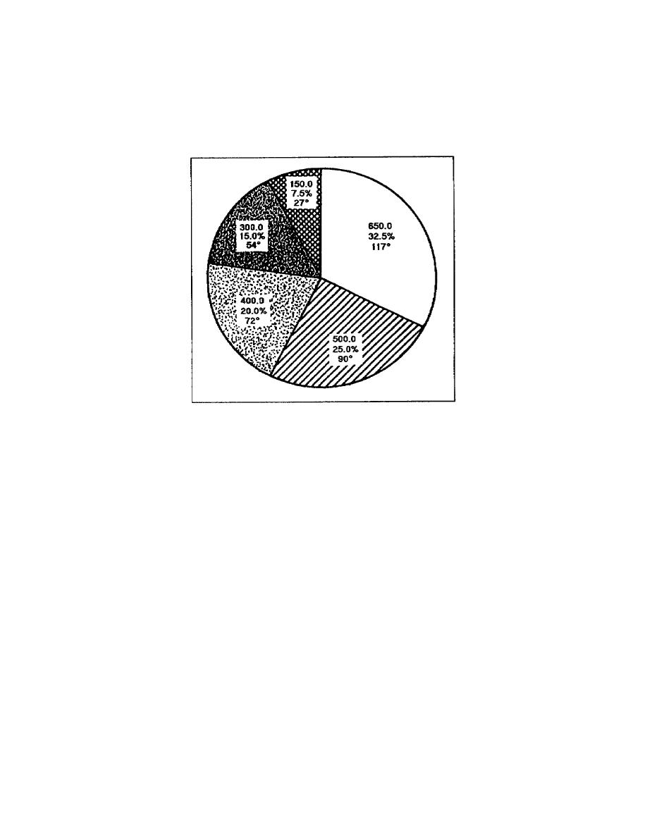
Take a moment to review figure 133. This pie chart represents the pie
chart developed in the lesson. This pie chart compares each expenditure
to the total budget. You can see the largest segment starts at the 12
o'clock position and the designer has plotted the segments from largest
to smallest, moving clockwise. Each segment has its relationship to the
budget and its percentage of the total indicated.
Figure 133. Budget expenditure pie chart
(b) Shading in a pie chart. Additionally, shading provides
contrast to the segments. The designer added shading from light to
dark, moving clockwise, and did not obscure the lettering on the chart.
Whenever possible, the pie chart was lettered in the appropriate
segment. However, when the segment was too small to accommodate the
lettering, the designer placed the lettering so the reader can see it
without taking his eyes off the chart. The designer also used leader
lines to identify segments to which the information belongs.
(5) Pie chart comparing size of segments. You also can use a pie
chart to make a comparison between the size of the individual segments.
To prepare this type of chart, you use the process described in the
preceding paragraphs. You must calculate the percentages and the number
of degrees in each and plot this information the same way. With the
information plotted, you must draw the pie with the proper perspective
and depth, and slightly separate each segment. Figure 134 shows a pie
chart comparing the size of the segments to each other.
1-40
SS0530


 Previous Page
