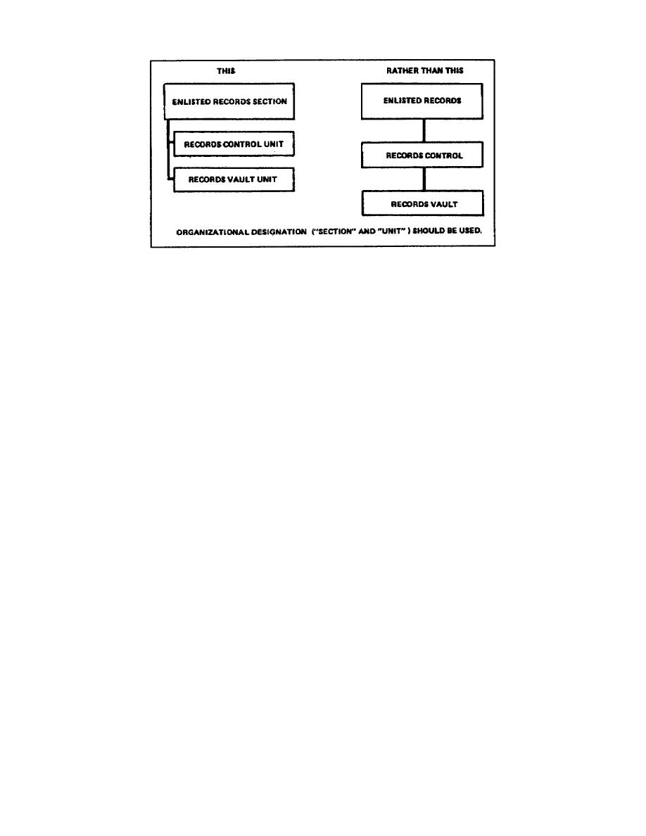
Figure 141. Alignment and authority lines
(4) Organizational chart effectiveness. When completing the
organizational chart, you must ensure the command or authority lines are
the heaviest (darkest) on the chart. To ensure the effectiveness of any
of these organizational charts, you must limit the information they
present to: (1) lines of authority, (2) responsibility, (3) spans of
control, and (4) functional authority. An effective organizational
chart has simplicity, clarity, completeness, symmetry, and unity.
(5) Simplicity and clarity. Simplify an organizational chart by
removing confusing or complicating elements. However, do not remove
required information just for simplicity or to make it easier to read.
For an organizational chart to present the unit correctly, it must have
all the elements.
Simplicity and clarity has a direct relationship. For an organizational
chart to have clarity, lines of authority should not cross and present a
crossing effect. Additionally, each block should have a label or title.
Figure 142 shows simplicity and clarity in an organizational chart.
Look at the differences between the two charts. Not only is the top
chart much easier to read, but it does not use diagonal lines, and the
lines do not cross. Also the section is drawn vertically, under the
responsible authority.
(6) Completeness. One goal for a welldesigned organizational
chart is identifying or showing how all sections relate to each other.
However, do not sacrifice clarity for completeness. Place any
additional information (e.g., subsidiary activities, additional duties,
inactive functions, etc.) required to
1-48
SS0530


 Previous Page
