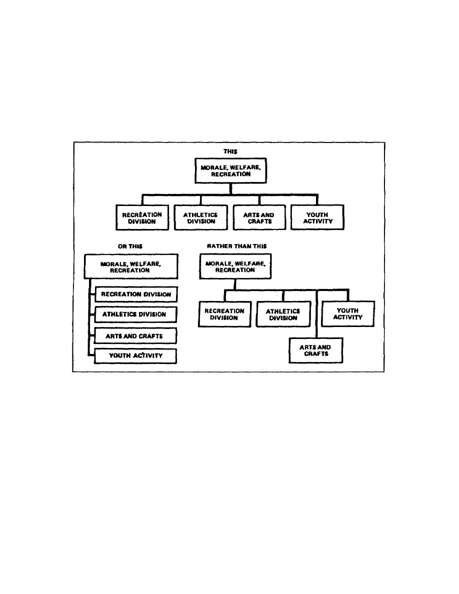
chart. It presents a uniform, eye pleasing appearance with the sizes of
the rectangles proportional to each.
Figure 143 shows two ways to present the same information in a
balanced, symmetrical chart. When looking at the unbalanced chart at
the lowerright side of the figure, it gives the appearance that the
athletics division, arts and crafts, and youth activity are set aside by
themselves. In reality, they have equal status with the recreation
division under morale, welfare, and recreation.
Figure 143. Balance and symmetry in an organizational chart
Another means of giving the chart symmetry and balance is to stagger the
subdivisions. This not only gives symmetry and balance, it adds
simplicity and saves space (figure 144).
(8) Unity. When an organizational chart has unity, it shows how
each component interrelates by connecting lines or through other
organizational elements. No element or branch of the chart exists by
itself. The chart must also clearly show how the elements interact from
their position in the command structure.
1-50
SS0530


 Previous Page
