true center equal to the distance determined by your calculation.
This
mark is the optical center of the work area. For example, if the length
of your work area is 15, you would place a mark on the work 1 1/2 inches
above the true center (15 € 10 = 1.5).
Use this mark as the vertical
center of your work.
The horizontal center is that point of equal
distance from each side of the work.
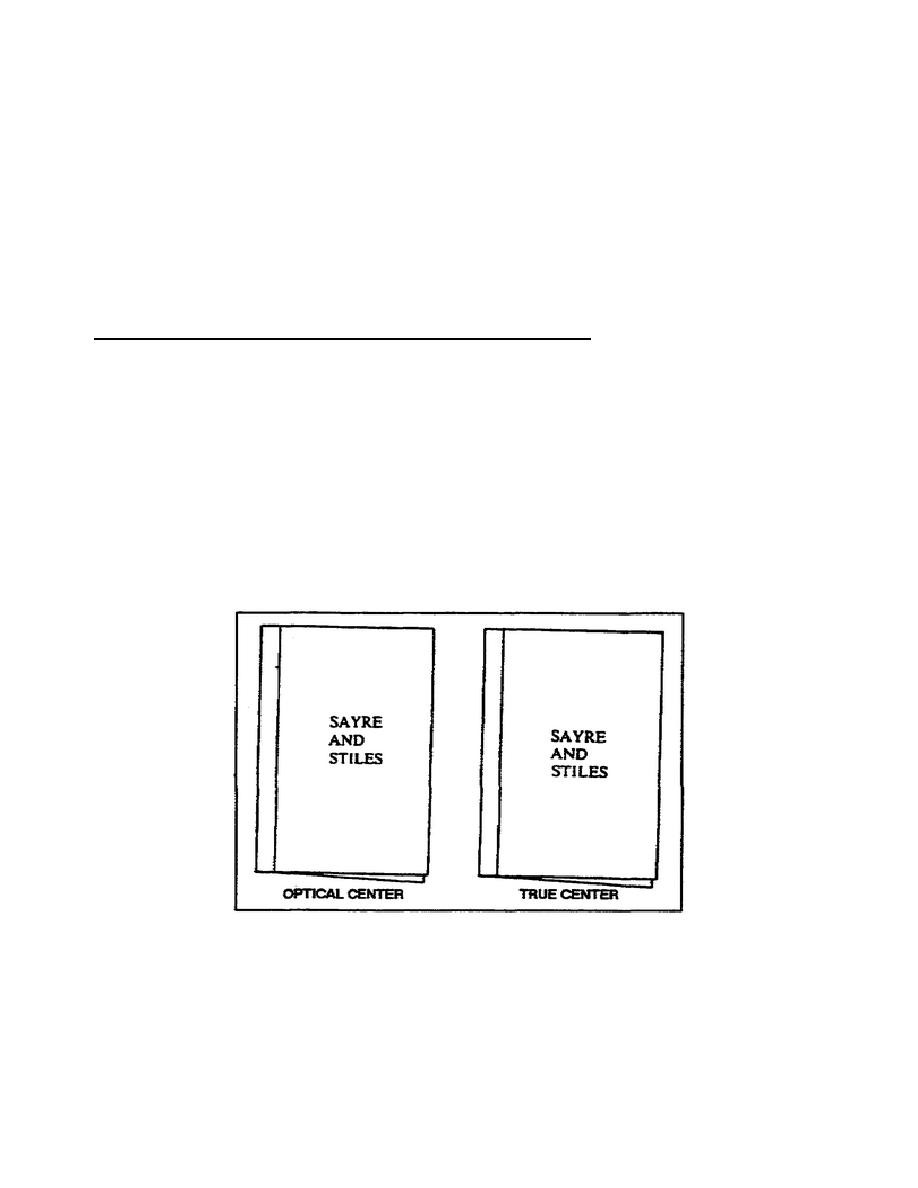
c. Refer to figure 1-15.
This figure provides a comparison between
work placed in the optical center (the text on the left) with work placed
in the true center (the text on the right). Notice that the work in the
true center appears below center, while the work in the optical center
appears balanced.
10. Distortions and Optical Illusions in Lettering.
The eye is often bothered by certain distorting effects that occur in
lettering designs. Many of these effects are of great concern to you as
they can cause an otherwise excellent lettering project to appear
distorted.
One illusion you are probably familiar with is the one that
makes certain forms (letters or letter combinations) of the same height
appear quite different in height when you place them side by side.
One
example of this optical illusion is when triangles, circles, and
rectangles (or letters that have these shapes) appear side by side.
Figure 1-16 demonstrates this illusion.
When such an illusion occurs in
your work, you must correct it to retain balance and legibility. Employ
the following techniques to correct such optical illusions.
Figure 1-15.
Comparison of true and optical centers
1-14
SS0525


 Previous Page
