fashion lacks uniformity.
Your lettering must have the same height,
style, and size. Lettering is an art that you must practice to obtain
proficiency and continue practicing to maintain proficiency.
Guidelines serve as an aid to creating uniform lettering. Guidelines are
light pencil lines that provide the means to achieve the consistency
needed for uniformity. When you apply only upper-case lettering, you use
only the base and cap guidelines. When lettering consists of upper- and
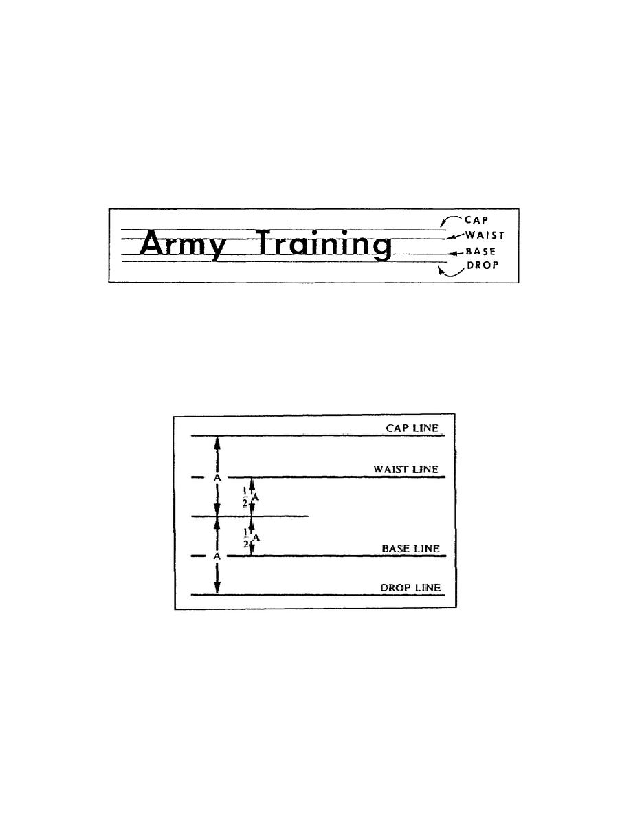
lower-case letters, you must use the cap, waist, base, and drop
guidelines (figure 1-56).
Figure 1-56.
Guidelines for lettering
When laying out guidelines for upper- and lower-case letters, the height
of upper-case lettering is 1 1/2 times the distance "A" (figure 1-57).
When establishing the guideline for lettering, set a compass or divider
to distance "A" and mark the distance you have selected above and below
the midline. These two marks establish the cap line and the drop line
(figure 1-57).
Figure 1-57.
Layout of guidelines
Next you must locate the base and waist lines. To locate these lines,
set the compass or divider to 1/2 of "A." Then using the same midline,
mark the distance 1/2 of "A" above and below the
1-63
SS0530


 Previous Page
