midline. These two marks establish the position of the base and waist
lines (figure 1-57).
You also can use vertical guidelines with horizontal guidelines. When
used, space vertical guidelines randomly along and parallel to the
horizontal guidelines. Vertical guidelines provide a reference point to
the vertical plane that you can use to ensure your lettering remains
vertical.
For inclined lettering, you can use inclined guidelines, known as
"direction lines," with the horizontal guideline.
Use the angle best
suited for the lettering project.
Normally, direction lines slant no
more than 68.
b. Proportional Lettering.
When lettering is proportional, all
letters are the same height and width. When lettering a graphic project,
the lettering must have the same proportion when used in phrases,
sentences, or presentations.
If the lettering on a project is not
proportional, it distracts from the eye appeal of the project and often
distracts the reader of the intended message.
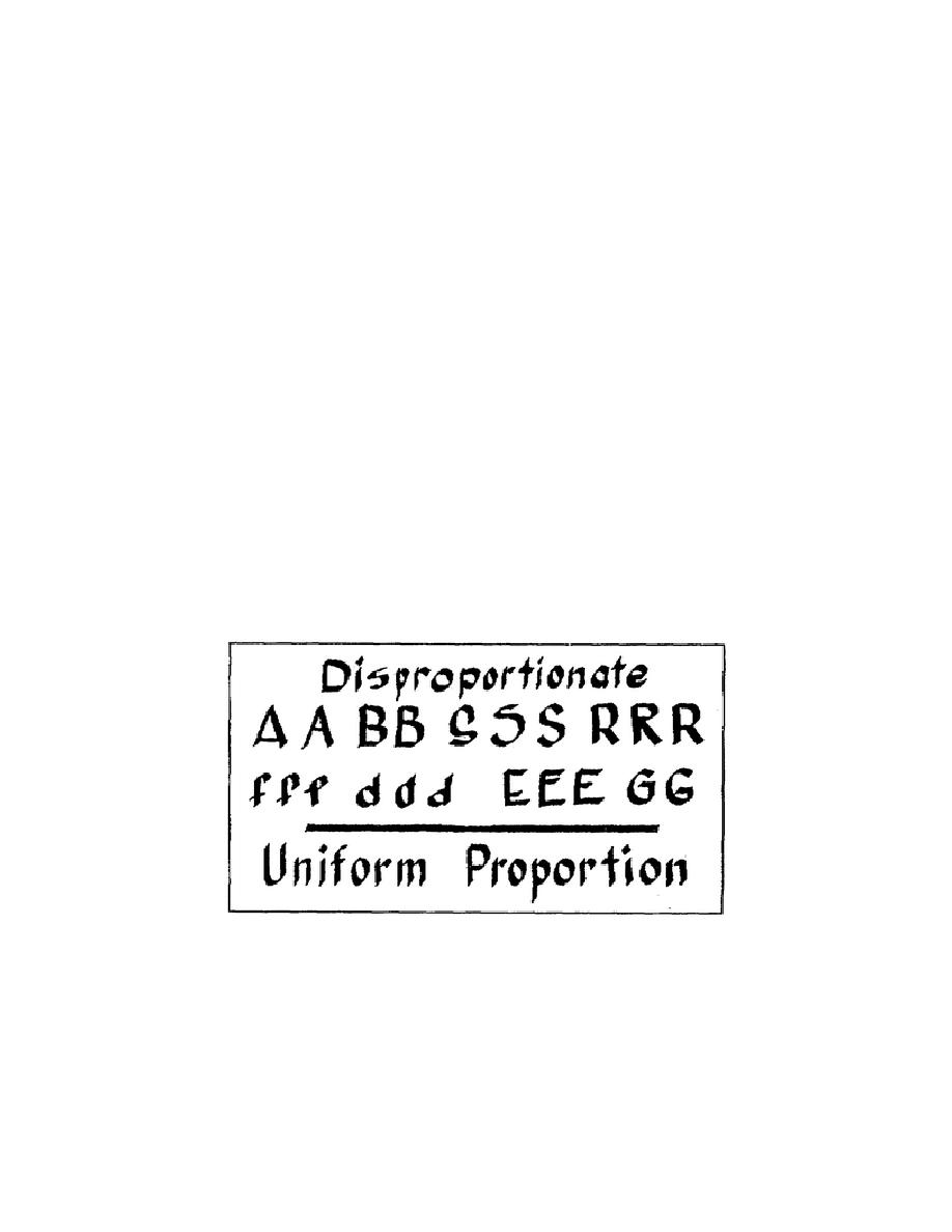
Figure 1-58 shows disproportionate lettering and uniform, proportional
lettering. After reviewing the lettering in the figure, you can see none
of the disproportionate letters are the same; and they distract from the
clarity of the lettering. The uniform, proportional letters are the same
size, easy to read, and eye appealing.
Figure 1-58.
Example of lettering
c. Letter Stability.
Stability makes lettering appear balanced.
When applied correctly, most letters appear balanced (e.g., W, R, T, Y,
H, M, and X). Unfortunately, some lettering
1-64
SS0530


 Previous Page
