ink is still useful when lettering posters, signs, charts, and displays.
The wide variety of inks presently available range from a high pigment,
opaque India ink to low pigment writing ink to inks of many colors.
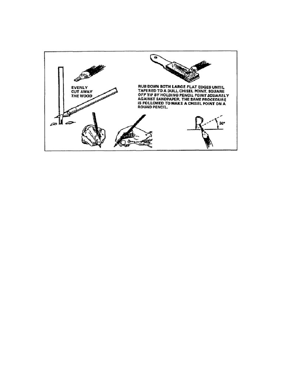
Figure 1-62.
Sharpening and holding a carpenter's pencil
(1) Guidelines for pen and ink lettering.
When using a pen to
apply lettering, hold the pen as you would a drawing pencil. Do not hold
the pen tightly because you lose the sense of feel required to construct
the letters correctly.
Always pull the pen in the direction it is
leaning when you are holding it. If you try to push the pen, the tip
digs into the paper and splatters ink over the project.
Once you have selected the style and the type of pen you will use,
lightly draw the guidelines and letters. Do not forget to use direction
lines if you must apply slanted lettering, usually 67 for italic
lettering. Once you have the guidelines and lettering in place, you can
rearrange the drawing surface to a comfortable position; however, ensure
you position the project so you have a constant point of view.
This
assists in producing uniform lettering.
Begin applying the ink by dipping the tip of the pen into the ink bottle.
Remove any excess ink from the tip by touching it to the side of the
bottleneck. Each time you re-ink the pen and before applying ink to the
project, you should make two or three trial strokes on a piece of scrap
paper. This allows you to ensure the tip has the correct amount of ink
in the nib. The trial strokes also allow you to check the quality of the
lines,
1-68
SS0530


 Previous Page
