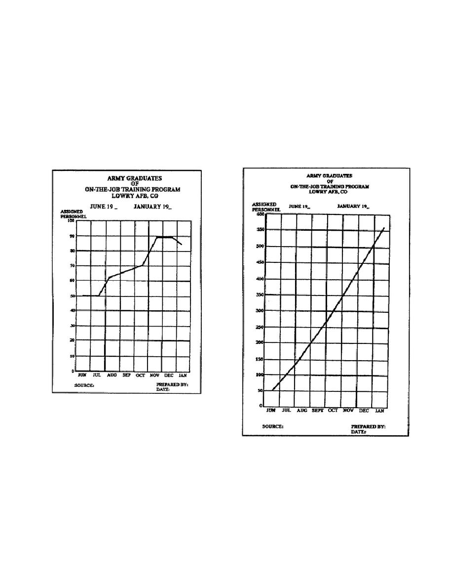
which is useful when comparing the desired activity and the actual
activity.
Figure 1-25 shows a cumulative curve chart. The first point plotted is
the number of graduates (50) in June. The second point plotted is the
total number of graduates (100) in July, which represents the total
graduates in June (50) and July (50). Each of the remaining points are
cumulative totals of graduates.
From this chart you can assign
intermediate values. That is if the graduation takes place on almost a
daily basis, you can go to the point on the curve that represents the
date and the scale line that the curve crosses is the number of graduates
(total) to that date.
Figure 1-24.
Broken curve
chart
Figure 1-25.
Cumulative data
line chart
You also can use a cumulative line chart to present consumption of items
by plotting two lines on the chart.
To do this, you would plot the
desired consumption for the time period, and then plot the actual
consumption of the item. At a glance the reader
1-31
SS0530


 Previous Page
